Hey Guys!
Schedule Master has been working with a new “front end” user interface for their scheduling page for quite some time. You may have played with it, as it has been available as a “beta” interface over the last year or so. I’ve played with it, and I really like it. Some of the benefits of the new interface are:
- In the longer duration views (i.e. 9-day), all schedulings will display, none are hidden from that view no matter how short (this has been an issue in the “older” interface).
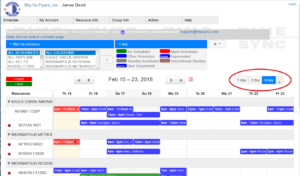
- Multiple schedulings on the same day show up “stacked” instead of side-by-side. This allows display of more complete information.
- There’s a new “calendar” view that shows all schedulings for the month.
- The “new” format can be selected and be set as your “default” view. Before it would revert back to the “old” view after you log out and back on. I’ve found that this “sort of” works. I prefer the 9-day view and that’s what I’ve tried to save as default. However, when I log out and back in, I get the new format, but the 1-day view.
- If you prefer to view the schedule organized by airport (see below), you can collapse and expand airports to display/hide resources at airports that you do/don’t care about.
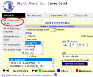
There are other changes and benefits, but you’ll have to check them out for yourself. To enable the new interface, simply click on the “Schedule” tab and then select the “All Schedules – NEW” item in the drop down list.

Once you see the new style schedule displayed, you can use the control at the top right of the schedule list to configure how many days to view and in what format. Fire it up and check it out. If you don’t like the new format, you can go back to the Schedule tab and select the “Original” from the drop down list to continue using the “old” format.

Post a comment below to let us know what you think of the new system!
Blue Skies!!
Jim David

I’m still on the fence regarding my views on the new interface. I’ve taken several looks at it and am still undecided….